French Press Technical Illustration

This was a very long project, starting with some basic sketches of the object to be done and ultimately producing a realistic technical illustration in Illustrator of the object “exploded,” that is, with all of its parts visible.

I began with these pencil sketches of my chosen object, a Mr. Coffee French press, which produces my husband’s lifeblood every morning. Then the work in Illustrator began. This was the first draft of the object, just a simple line drawing on an isometric grid, with a color background so that the transparencies could be seen.

Next to that is the second in-progress version, also shown with a draft mockup of the product’s presentation. It’s clear that some things were developing well, like a couple of the gradient meshes used on the lid and the flat plates, while some things were still eluding me, such as the right gradient to use on the cylindrical frame and smoother shaping of the handle.

(If you click that image to embiggen it, you can also see the false starts with fonts and layout of the annotations, and the messy spirals on the spiral plate that I gave up on that night. They were hard, dangit!)

But after lots and lots of work on those things, and much refining of the gradient meshes (during which I learned A TON about using them: namely that I’d been doing it wrong from the beginning and really needed to start over!), this was the final result.

final-version

This is just the exploded object by itself, clean with no background or mockup, although the purplish reflected light is kind of obvious. (I used that purple because of the background colors in the mockup, which are based on Mr. Coffee packaging.) That handle’s looking a lot better, as are the linear and radial gradients on the cylindrical shapes and the meshes in general. The spirals on the spiral plate look more spirally AND connected to the plate. Plus! There are glinting edges on the frame and carafe, so they don’t look two-dimensional. But you can probably see them better in…

The final mockup!

frenchpress

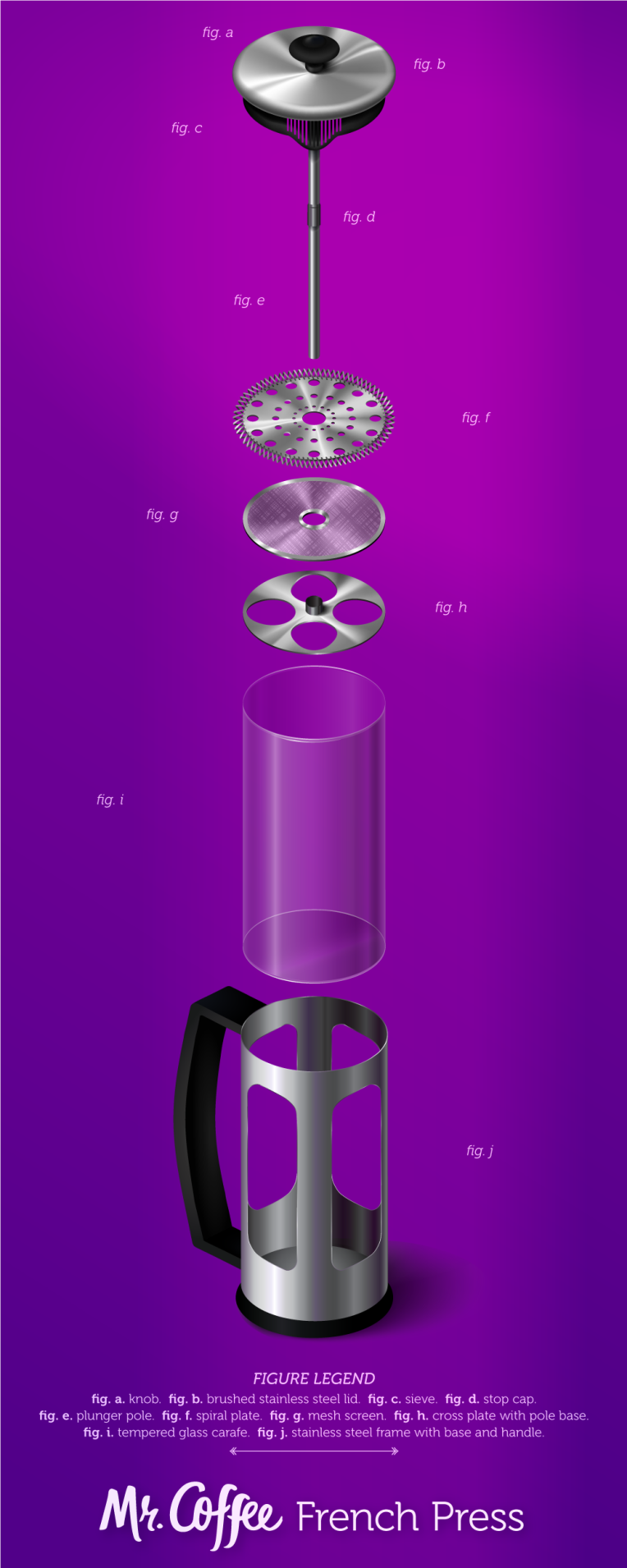
Shadows and reflected lighting and light flares, oh my! Plus a font overhaul (thank you, peers who suggested doing so), and a return to my original idea for the layout.

Were this to be printed, it would need a specialty size, but there is a standard-ish specialty size for it, as I found. But this is a tall object fully exploded, and I decided to work with that instead of against it.

Project 2 – Vodka Label, pt 2

Feedback on the thumbs and roughs was mixed, as I expected. There was no clear consensus from other classmates on the direction I should go in. But a couple people pointed out that the ideas with the cloud and the pie/piece of pie looking “heavenly” might not send the right message to the target audience. And someone pointed out that the idea from the 3rd rough, the cutout “A” in the words “pecan” and “dream” forming the slice of pie, might not translate well to the curved shape of the bottle.

So I went with the 2nd rough idea, which seemed like it had the most potential given those considerations. I designed it to wrap around the bottle, and chose just one color from the original color “palette” to base the other colors around.

Here’s a look at the work in progress. At this stage, I’d placed the pie and pecan elements and added texture to them, and I’d placed the text where I felt it would look best. But I wasn’t too in love with the text colors. And I felt like adding some flat shadows to the pie and pecans would add to the overall composition and make things look more elegant.

rough

After much tooling with shadows, textures, and spot (!) colors in the text, this is where I ended up.

artboard-1-100

I also included a mockup of the label on an actual bottle. Though I don’t think that part turned out super great, despite several attempts to make the label look less wonky, I’m showing it here just to be thorough.

bottle

What you can’t see in the digital image is that all of the text on the label (except the government warning) would be printed in shimmery spot colors, adding to the “dreamlike” effect.

Short Project – Branding

This very first, and very short, project was about creating some pieces of branding for a (fictitious?) client, Junior Aquatics. We were tasked with coming up with three pieces for a hypothetical client meeting, to be delivered in a half hour. Apparently quick turnaround like that can be expected in the real world sometimes. Which terrifies me a little now, because, full disclosure, this took me more like an hour. And honestly it would have taken longer if I hadn’t already had a couple of mockup templates just sitting around. I had to find the third, which took longer than I’d hoped, because the ones in the top few results of my Google search were priced, and I’m broke, so I had to wade around for a free one.

But anyway, this frustrating little exercise turned out the below spread of mockup items: a t-shirt, a water bottle, and business cards.

neaswalls_junioraquatics

I dunno, but I dig the wavy stripes.