Zebra character final

The finished version of the zebra character is here! Changes made between the WIP2 version and this one are kind of minimal, but I think they make her look better overall: the right arm was pulled away from her body to be less likely to “disappear” from the arm and body stripes blending. Accordingly, the stripes and shadows were adjusted.

Also, green background this time, just to be different. Actually, the three background colors I’ve shown so far are, funnily enough, the three main colors I’m using in the patterns on the hangtag, which I will post here when it’s done.

And now for the zebra!

character final

Project 2 – Vodka Label, pt 2

Feedback on the thumbs and roughs was mixed, as I expected. There was no clear consensus from other classmates on the direction I should go in. But a couple people pointed out that the ideas with the cloud and the pie/piece of pie looking “heavenly” might not send the right message to the target audience. And someone pointed out that the idea from the 3rd rough, the cutout “A” in the words “pecan” and “dream” forming the slice of pie, might not translate well to the curved shape of the bottle.

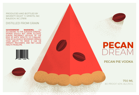
So I went with the 2nd rough idea, which seemed like it had the most potential given those considerations. I designed it to wrap around the bottle, and chose just one color from the original color “palette” to base the other colors around.

Here’s a look at the work in progress. At this stage, I’d placed the pie and pecan elements and added texture to them, and I’d placed the text where I felt it would look best. But I wasn’t too in love with the text colors. And I felt like adding some flat shadows to the pie and pecans would add to the overall composition and make things look more elegant.

rough

After much tooling with shadows, textures, and spot (!) colors in the text, this is where I ended up.

artboard-1-100

I also included a mockup of the label on an actual bottle. Though I don’t think that part turned out super great, despite several attempts to make the label look less wonky, I’m showing it here just to be thorough.

bottle

What you can’t see in the digital image is that all of the text on the label (except the government warning) would be printed in shimmery spot colors, adding to the “dreamlike” effect.

Insert for Apartment Info Folder

The past couple of weeks, we worked on a project designing a half-page, double-sided insert that would go in a standard pocket folder and be accompanied by information sheets on the apartment complex. The insert is supposed to showcase the available floorplans and show a property map on the back.

I started by doing rough versions of the property map and the floorplans in Illustrator, which you can see here. The floorplans PDF also includes some typeface ideas. I’ve put up the PDFs of these instead of inline images since they are, in fact, rough.

neaswalls_map01

neaswalls_3floorplanstype

Next stage was getting a preliminary design of the front and back of the insert, which you can see below. This part was done in InDesign. I always feel like my in-progress pieces are very much in-progress-looking. I tried out some “designy” things in this stage that didn’t work really (the dotted lines and circles) and was trying to pull the colors from the company logo, because I had a really hard time coming up with something else good at first.

And finally, the final stage for this project. Lots of things are readily different. I still had a hard time finding a satisfying layout for the back page with the map, but settled on what’s here because it fits the front side and isn’t the worst ever.

The colors this time are much closer to what I had in mind from the beginning: bright, springy greens and blues inspired by lush gardens. And this way, the pink of the hummingbird in the logo stands out more. I am still not 100% on the map, but after trying out some texturing in Illustrator and being thoroughly convinced that just didn’t look very good, I left it clean.

Project 1 – Real Problems, Real Solutions, pt 2

Here are some of the campaign materials in progress, in the first stages of designing. At this point, I had only gotten the button and pillow box/seed packet done with color in Illustrator, and the brochure, info card, and plant card into preliminary layout in InDesign. I didn’t even have a layout for the print ad yet!

But that changed pretty soon. I started developing the brochure first, figuring that would set the tone and theme for all the remaining items, and I could adjust the button and pillow box as needed after that. The illustrations were done in Illustrator and the layout finished in InDesign. Same for the print ad, which followed the brochure.

I narrowed the fonts down from the comps stage, to 3, which I’m way more comfortable with than 4, especially if they’re all different. And it’s pretty clear I’m reusing whole chunks of the floral pattern. For some reason, this felt like cheating at first, but saved SO MUCH TIME over generating different patterns for each doc, which was my original dumb idea.

Using the patterns and the other motifs, I filled in the layouts of the two cards, and I ended up doing them in Illustrator completely, no InDesign finalizing. The pillow box and the button were last. The pillow box had a re-color and font update, and the button didn’t really change beyond having the side print font updated.

Overall, this was a really fun project, and the first time I’ve done most of these items. Hoping at least a few of them will end up in my portfolio.

Finally, here they all are mocked up for extra viewing fun!

Final project

Here it is, the last drawing project! For this one, we were to use a model and draw a bust portrait, having the model draped in cloth. Fabric is possibly the only thing I’m still a little uncomfortable drawing, even with the practice I gave myself before doing this piece. So in an attempt at fearlessness, I used two blankets in this composition. Because I’m like that.

The model is my husband. He was drafted for this project primarily because it was easy for him to find time to sit for it, but I think he actually enjoyed the experience. Behind him is a menorah in a Tree of Life design. It’s not just a prop, he is Jewish (why else would we have one laying around?). But I admit I included it because after looking at him sitting in front of a blank wall with a big glare on it, I felt like there needed to be something to catch the light and add a different texture. Plus the gold candle cups provided a pop of a different color to contrast the blue wall.

Materials: dry pastel, charcoal, colored pencil, white ink.