Zebra custom die-cut hangtag

I’ve already posted a couple of times about the Grevy’s zebra character design process. But now I want to share the process of designing the hangtag that the zebra character was developed for. The idea was to create something that would hang from a plush animal, and would show the illustration of the animal, its name, some good facts about it and its endangered status, and present the WWF logo and proceeds line and a barcode.

I printed the thing and actually hung it on a zebra plushy I have and took a few snaps of that, and it’s adorable, so those will be included too. But first things first: the original concept sketches for the tag.

hangtag_roughs

Not the most exciting tag shapes, I know. At this point, I was primarily concerned with getting some idea of how to incorporate the Ethiopian tibeb patterns, which can be very simple or very complex and use lots of colors. Traditionally, they are patterns made in a strip at the hem of a garment, and can be of varying widths. The most common patterns I saw used in my research were based on diamonds, and that’s what I used.

A couple of examples from good old Google of authentic tibeban:

Figuring out a better die-cut shape came later. It was made by uniting several elongated diamond shapes (it’s everywhere!) stacked over each other.

custom die guide

The magenta guide shows the shape, with the general location of the zebra character. I like its funky angles, and I think people would be more inclined to physically touch it because of its odd and irregular shape. Cute zebra on the front is a bonus.

Onward. Doing the tibeb patterns was really the trickiest bit. The goal was to use several rich and vivid colors in the patterns (in keeping with tibeban Google found for me to draw from), but not too many different colors, and lay “hems” of various patterns next to each other, but have each pattern be distinguishable next to the others, and use bold zebra black and white for text/text-boxes so they would stand out, AND not do anyone’s head in with a crazy jumble. Et voila.

It works! I think. Shown here with die guide and bleeds, which were cut off by my handy X-ACTO blade after printing to some cardstock.

My home printer is a basic inkjet, so there was some color quality loss, but not too bad. Gluing two funky shapes back-to-back while trying to get the edges and corners lined up just right was way harder than I imagined. Which reminded me a) why I don’t do a lot of fiddly crafts (I have big fingertips and no patience) and b) that I need to make myself learn paper cutting (I need more dexterity and patience). Sisyphean task? Only time will tell.

Finally, for the best part of this whole project: the plushy with the hangtag on it. Just to be clear, I did not go to a store and buy this plushy just for this occasion. I already had it. Yep.

Project 4 – GSM, pt 2

The culmination of the standards manual prep mentioned in the last post, here is my take on the Crucible identity guidelines. This is the front cover image only, but clicking on it should open the whole PDF document.

gsm-cover

Document assembled in InDesign; some of the more image-heavy layouts created in Illustrator; mockups done in Photoshop.

Now, honesty time. This project was a bit overwhelming, due to the large scope of it and just how many moving pieces there were to manage. But we were given just the regular two-week timeframe for it, with a round of feedback at about the mid-point. And I know, the real world. But as this is a classroom assignment, and something probably none of us has ever done before, it would be much better spread over three weeks. Not just because of how big the project is, but also because then there could be a second round of review. Speaking for myself, I really wish we’d had another peer review session. The first round of review came at such an early stage in the development of this project, that I don’t think it allowed for really useful constructive feedback.

Generally, I’m happy with the overall output, but I’m also conscious of the weak spots. For instance, I could never quite land on a cover design that was really it; this one here is just what I decided was “finished enough.” If I decide to include this in my portfolio later, I’ll definitely come back to this and retool those spots.

For now, here’s a mockup of the cover and some of the interior pages in a magazine-like form, which is roughly how I envision this would be printed.

crucible-mockup

Zebra character sketch

This is also an assignment, in a different class, but I’m posting it just because I want to. (Hey, maybe I’m starting to like doing this sketchblog thing! But I better not consider that too much, or it’ll run away.)

This is part of an ongoing project that will ultimately result in making a custom die-cut hangtag for a plushy, sponsored by the World Wildlife Fund. (NB: I’m unclear if the WWF is actually part of this assignment in any real way. I don’t imagine so. But it’d be pretty cool if they are.) I chose Grevy’s zebra as my animal to base a character on, mostly because zebras have been my favorite animal forever.

In a previous life (read: high school), I drew TONS of characters with my friends. We were into really nerdy things and loved to draw, so it happened. But for some reason, I was anxious about doing this. I felt like I suddenly knew nothing about creating an anthropomorphic character (which is patently untrue) and have second-guessed myself every step of the way. Maybe that’s because this one is for a grade. Or maybe my brain just hates me that much. Who knows.

Anyway, here is the process so far: the original sketch, the first WIP, and the second WIP. The differences between the two WIPs are mostly shading and making the smile and eyes bigger for a cuter effect.

She’s cute. I now have this idea to build a story around her and do some spreads that would be fit for a children’s book. I’m sure I can get that done in my copious spare time.

Project 3 – Empty Book, pt 2

For the empty book project, I chose to develop one of the cat book concepts: Cats Who Approve of You. I have several cats (I’m sure I’ve mentioned that before), all of whom are snide and snooty and very disapproving of me and my husband, or any human. So the idea of an empty book purporting to be about cats who do approve of you struck me as quite funny, since really, there are none to be found anywhere.

I wanted the design to communicate the snobbery of cats. The idea of a cat in a pose of walking away from you was there from the first. And the cat’s rear had to be on the front cover, because that is the ultimate in cat flippancy. Continuing with that, I landed on the idea of an antique, florid background pattern complete with (dancing?) crowns to really make the point that cats know they are better than you.

The book was recently printed by Lulu, so I’m going to share the pictures of the cover from the real thing. There’s even a picture of the spine (and a bit of my fingers holding the book)! If you want to see that sort of thing.

To find out about the process and whatnot, read on.

Here’s how things looked at a point in the process where I’d created the pattern, mostly, and the cat, also mostly. I’d also spent quite a while fiddling with the title text, getting every letter placed, but no other text had been done yet.

wip

And here’s the final(ish) version–the version to turn in for the assignment, anyway. All the text is in, some of the text colors have changed, AND there are now cheeky little crowns in the pattern.

final

That space on the back is set aside for the barcode and the Lulu identification number. According to the Lulu’s FAQ database, you’re not expected to upload your cover art with a barcode already there–or it won’t print–which makes sense. But looking at it, it looks a little empty as is.

There are still tweaks to be made to the design before getting it printed, but overall I’m happy with the character of this. I hope I’m not just incredibly biased toward my own awesome self. But book cover design is something I really want to get into professionally. So I know I’m going to be poring over the teensiest details of this before printing.

UPDATE: The tweaks were made, as you can see in the actual book cover images above. Also, you might notice that this book printed without a barcode. Why? I don’t know, but since I followed Lulu’s directions about the cover, I would like to find out. But that’s going to take some emailing back and forth, most likely, so for now it stands as is.

Project 3 – Empty Book, pt 1

For this project, we’re creating an empty or blank book built around the concept of something that doesn’t exist. You know the kind, you’ve probably seen them in the novelty racks in Target or in friends’ bathrooms. Something like “Ugly Bunnies” or “Dragons on Public Transport.” (Heck, that last one is pretty good–almost wish I’d gone with that.) And sometime before the end of the term, we’re to get it printed via Lulu.com.
Anyway, here are the thumbnails I came up with for the book cover. Very many silly ideas. The last four are specific to certain fandoms, Game of Thrones and Supernatural. In a perfect world, I would have done one of those because they were my very favorite ideas. But I didn’t feel comfortable creating (and printing!) something derived from copyrighted work. And the cat and dinosaur concepts were both in close second, so it wasn’t hard to make a decision.

What idea did I ultimately choose to develop? Find out next time…

Project 2 – Vodka Label, pt 2

Feedback on the thumbs and roughs was mixed, as I expected. There was no clear consensus from other classmates on the direction I should go in. But a couple people pointed out that the ideas with the cloud and the pie/piece of pie looking “heavenly” might not send the right message to the target audience. And someone pointed out that the idea from the 3rd rough, the cutout “A” in the words “pecan” and “dream” forming the slice of pie, might not translate well to the curved shape of the bottle.

So I went with the 2nd rough idea, which seemed like it had the most potential given those considerations. I designed it to wrap around the bottle, and chose just one color from the original color “palette” to base the other colors around.

Here’s a look at the work in progress. At this stage, I’d placed the pie and pecan elements and added texture to them, and I’d placed the text where I felt it would look best. But I wasn’t too in love with the text colors. And I felt like adding some flat shadows to the pie and pecans would add to the overall composition and make things look more elegant.

rough

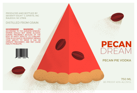
After much tooling with shadows, textures, and spot (!) colors in the text, this is where I ended up.

artboard-1-100

I also included a mockup of the label on an actual bottle. Though I don’t think that part turned out super great, despite several attempts to make the label look less wonky, I’m showing it here just to be thorough.

bottle

What you can’t see in the digital image is that all of the text on the label (except the government warning) would be printed in shimmery spot colors, adding to the “dreamlike” effect.

Project 1 – Real Problems, Real Solutions, pt 2

Here are some of the campaign materials in progress, in the first stages of designing. At this point, I had only gotten the button and pillow box/seed packet done with color in Illustrator, and the brochure, info card, and plant card into preliminary layout in InDesign. I didn’t even have a layout for the print ad yet!

But that changed pretty soon. I started developing the brochure first, figuring that would set the tone and theme for all the remaining items, and I could adjust the button and pillow box as needed after that. The illustrations were done in Illustrator and the layout finished in InDesign. Same for the print ad, which followed the brochure.

I narrowed the fonts down from the comps stage, to 3, which I’m way more comfortable with than 4, especially if they’re all different. And it’s pretty clear I’m reusing whole chunks of the floral pattern. For some reason, this felt like cheating at first, but saved SO MUCH TIME over generating different patterns for each doc, which was my original dumb idea.

Using the patterns and the other motifs, I filled in the layouts of the two cards, and I ended up doing them in Illustrator completely, no InDesign finalizing. The pillow box and the button were last. The pillow box had a re-color and font update, and the button didn’t really change beyond having the side print font updated.

Overall, this was a really fun project, and the first time I’ve done most of these items. Hoping at least a few of them will end up in my portfolio.

Finally, here they all are mocked up for extra viewing fun!