Is this thing on?

I know I’ve been quiet here for a little bit, but life has just been happening. I do have some new things to start posting, though. And the first one is…

This little video I made, about using Recolor Artwork in Illustrator! It’s a super handy tool and saves me lots of time changing colors in a project, or when I just want to explore a different color palette.

Check it out on my brand new tiny YouTube channel.

Happy designing!

About a Paragraph

I read this article from Print a couple of weeks ago, about the truly fascinating design history of the paragraph, and wanted to share it along with my thoughts.

Designer and writer Jason Pamental’s quest is to find ways of creating better web experiences, and to do that, he looks to the past, specifically to the history of the paragraph. His idea is that good web typography design should, like current trends in web design which are designed for flexibility, “focus on the smallest element and build from there. […] If we start by designing one great paragraph, down to every fine detail and nuance, as our content builds out, so will our typographic system, giving us a flexible, robust and considered foundation for the entirety of our content and the site beyond. This is true for any sort of site, but even more so in the age of responsive web design when our content needs to work well across nearly limitless numbers of screen sizes, resolutions and technologies.”

The paragraph, according to his research, began as a visual mark separating speakers or passages in ancient Greek texts, and continued that way until the printing press revolutionized (and sped up) book production, around which time its meaning shifted to the way we use it today to mean a discrete thought.

But it’s the visual methods of separation, or the typographic techniques, that still draw attention and that can, according to Pamental, be leveraged for better content design. Some ideas he comes up with include adding styling to the first line or first letter of a paragraph using simple CSS; enabling hyphenation for body copy, rather than scaling down for smaller screens; and using some PHP to control annoying type orphans as screens scale between devices.

So, designers with a traditional typography background can still bring their smarts to bear on web typography by starting with the paragraph, designing for it, and building out from there to create a fully responsive and dynamic design that always looks good.

The point he’s really driving home is that better content design on the web is going to happen in the small spaces. And I like his call to focus our attention on and be thoughtful about the small details of the paragraph and how it fits in with its surroundings, whether that’s a web page or a printed page.


This is a post about WEB214

Boy, starting/keeping a blog sure is a popular class assignment. At least in my classes so far!

I’ve been musing for a while about adding a new dimension to the purpose of this blog, and thanks to a prompt in my WEB214 class, I think I may have it. I mean, I have a writing background. I love design, illustration, art, etc. Why not…write about that? Genius, right?

One of the great things about design and illustration is that they look both forward and backward in time. Even while we design for the future, their histories are bound up inescapably in everything we do as designers and artists. And not coincidentally, they have a rich history of being employed to bring stories to vivid, fascinating life. I’m keenly interested in these things, alongside actually designing and illustrating myself, which is why I want to make writing about them part of my creative life.

So, here we are. All posts pertaining to this class, such as this one, will get their own special tag so they can be viewed more easily as a group.

Huzzah!

French Press Technical Illustration

This was a very long project, starting with some basic sketches of the object to be done and ultimately producing a realistic technical illustration in Illustrator of the object “exploded,” that is, with all of its parts visible.

I began with these pencil sketches of my chosen object, a Mr. Coffee French press, which produces my husband’s lifeblood every morning. Then the work in Illustrator began. This was the first draft of the object, just a simple line drawing on an isometric grid, with a color background so that the transparencies could be seen.

Next to that is the second in-progress version, also shown with a draft mockup of the product’s presentation. It’s clear that some things were developing well, like a couple of the gradient meshes used on the lid and the flat plates, while some things were still eluding me, such as the right gradient to use on the cylindrical frame and smoother shaping of the handle.

(If you click that image to embiggen it, you can also see the false starts with fonts and layout of the annotations, and the messy spirals on the spiral plate that I gave up on that night. They were hard, dangit!)

But after lots and lots of work on those things, and much refining of the gradient meshes (during which I learned A TON about using them: namely that I’d been doing it wrong from the beginning and really needed to start over!), this was the final result.

final-version

This is just the exploded object by itself, clean with no background or mockup, although the purplish reflected light is kind of obvious. (I used that purple because of the background colors in the mockup, which are based on Mr. Coffee packaging.) That handle’s looking a lot better, as are the linear and radial gradients on the cylindrical shapes and the meshes in general. The spirals on the spiral plate look more spirally AND connected to the plate. Plus! There are glinting edges on the frame and carafe, so they don’t look two-dimensional. But you can probably see them better in…

The final mockup!

frenchpress

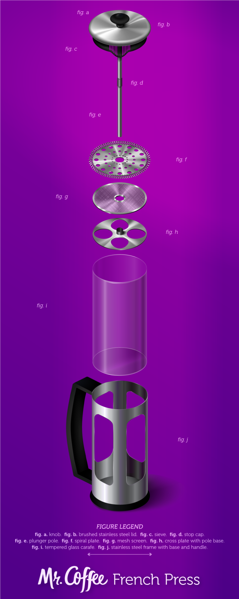
Shadows and reflected lighting and light flares, oh my! Plus a font overhaul (thank you, peers who suggested doing so), and a return to my original idea for the layout.

Were this to be printed, it would need a specialty size, but there is a standard-ish specialty size for it, as I found. But this is a tall object fully exploded, and I decided to work with that instead of against it.

Project 8 – Email Newsletter

The focus of this assignment was to create an email newsletter “based on the subject of medicine or veterinary medicine for retina devices.” After some research, I decided to interpret that as veterinary ophthalmology, which is a specialty surgical field of vet medicine, and so I created my newsletter along those lines.

I made this at a set width of 600px, since, according to my research, that is a standard width for email marketing templates. Length is somewhat less of a concern, as email users are used to scrolling down to see more content.

After looking at other email newsletters for products and services (rather than information-driven newsletters like the ones I’m familiar with), I decided that mine should be pretty short (both in terms of content and pixels), with a focus on images, and grabby headlines with brief copy introducing each article before a “Read more” link.

Here’s what it looks like mocked up in an email like you might actually see in your inbox.

mockup

Images were grabbed from Pexels and have a CC0 license and were edited in Photoshop. The spring floral pattern used came from Freepik. The fake-company OCULR logo was done quickly in Illustrator.


Project 7 – App, pt 2

Just wrapping up from the last post about this app project now.

After the second round of feedback, I made sure to make some serious adjustments to font size throughout the app. I’d clumsily gotten used to looking at everything zoomed in where I was making small tweaks, and forgotten to check for readability at roughly the size of a real smartphone.

Other things that were added between stages: a fourth main menu item and its attendant pages, a contact info screen, a login screen, and a small user area.

This page from the PDF presentation shows the splash screen as well as the app icon, both standalone and in position on the phone’s main screen. Clicking this image opens up the entire PDF.

neaswalls_app-presentation

Project 7 – App, pt 1

This assignment is another doozy! For this, we were to design a mobile app that doesn’t but should exist. Every screen of the app would need to be created, as well as an icon for the app, and then the app would need to be mocked up in a PDF presentation.

My bookish and nerdy tendencies led me to a “baby name” generator that initially would pull from literature, but on suggestion of my husband, quickly expanded to include history and fandoms as well. There are tons of great names given to figures both fictional and larger-than-life, and if you mash them up, voilà, an even better name. With this app, there’s never a need to reach for the nearest object to hand when naming your baby (I’m looking at you, Blanket Jackson), or your pet, or your own character if you’re a writer. Hermione Havisham! That’s rad. Cersei Roosevelt! Or maybe don’t name your baby Cersei. But here I am, getting ahead of myself…

The first stage of the project was to come up with a few preliminary screens, to give an idea of what direction we were taking. Then we had another round of feedback a few days later, when we presented our progress thus far.

Here are the screen images of 1) the main progression from loading screen > about page > main menu (which at the time only included three items); 2) generating a name from the selections page > results; 3) searching for a name using the search form > results list; 4) submitting a name to the app’s database via the add form. I know these look tiny, but clicking any of them should embiggen the image for better viewing.

This project’s conclusion in the next post!